If I were ever to need a Tinder dating profile, I would ask the fine people at Pantone to write my bio.
Pantone is the global colour expert and recently announced Very Peri as the colour of the year for 2022. In announcing — PANTONE 17–3938 Very Peri — they described the colour as “a dynamic periwinkle blue hue with a vivifying violet-red undertone blends the faithfulness and constancy of blue with the energy and excitement of red.”
What an excellent description for a colour. A simple colour.
Except colours aren’t simple.
It’s the reason why Pantone announces their annual colour of the year. It’s why Google obsessed over which shade of blue to use to increase the clickthrough rate on their ads.
And it’s why, if you’re a content creator, you need to be obsessed with colour as well.
I’m blue; if I were green, I would die
Back in 2007, Google launched ads on Gmail — these were tiny blue links contained in emails that would lead users to other websites. They were also running similar ads in their search product — but with a slightly different shade of blue.
This offered them the opportunity to run a test to see which shade of blue had higher clickthroughs. Many companies would run a simple A/B test and choose which of the two blue shades performed best. But as we know, Google thrives on data. And two tests aren’t enough.
“In the world of the hippo, you ask the chief designer or the marketing director to pick a blue and that’s the solution. In the world of data, you can run experiments to find the right answer. We ran ‘1%’ experiments, showing 1% of users one blue, and another experiment showing 1% another blue,”
Former Managing Director for Google UK, Dan Cobley.
So Google tested forty more shades of blue — 42 different shades in total.
“And we saw which shades of blue people liked the most, demonstrated by how much they clicked on them. As a result, we learned that a slightly purpler shade of blue was more conducive to clicking than a slightly greener shade of blue, and gee whizz, we made a decision,” said Dan Cobley.
Gee whiz, forty-two shades of blue may seem overkill, but it was time well spent.
By obsessing over the perfect shade of blue, Google made an extra $200 million a year in advertising revenue.
The most swiped guy on Tinder
While no one reading this can win the Colour of the Year, many of you can aim for another title.
The most swiped guy on Tinder.
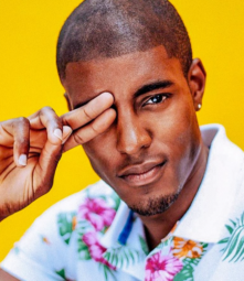
That title currently belongs to Stefan-Pierre Tomlin, who was awarded the title of ‘Mr. Tinder’ in 2017 due to his prolific number of matches. Between 2015 and 2017, he received over 14,600 matches and perhaps a repetitive strain injury in his finger from excessive swiping.
Tomlin credits much of his success due to the image — and more importantly — the colours he chose.
“You need to have a photo on a bright background — it pops for people as they’re swiping through,” Tomlin says. He makes sure to use two colours in almost all his photos, and in a boon for the Swedes reading this; he recommends yellow and blue.
“People with blue in their photos — whether that’s graffiti or the ocean or bright blue skies — get more swipes than others.”
Source: Instagram
In the photo above, Tomlin uses yellow, and when combined with his colourful shirt and, yes, his attractive face, it was a beacon for people swiping.
Walking on the blue carpet
Back when the world was panicking about Y2K — don’t we long for world problems like that now — Pantone decided to launch their colour of the year.
In 1999, very few people outside of graphic designers knew what Pantone was or what they did, mistaking it for shampoo or Italian bread.
The very first colour of the year was — in a surprise to no one reading this article — a shade of blue. Cerulean Blue, to be precise.
The inaugural winner of the colour of the year. Cerulean Blue. Source
Each year, Pantone makes its decision after studying colour influences worldwide, including within entertainment, art, fashion, architecture, and even political and socio-economic conditions.
But blue seems to reign supreme. In 2020, Classic Blue was named the colour of the year.
“Blue, from an emotional, psychological standpoint, has always represented a certain amount of calm and dependability. It’s a colour that you can rely on.”
Leatrice Eiseman, the executive director of Pantone’s Color Institute

The inaugural winner of the colour of the year. Cerulean Blue. Source
Each year the recognition for the importance of colour increases, and businesses and designers eagerly await the naming of the colour of the year.
This year’s announcement was celebrated with an immersive art gallery in New York that even housed a special NFT room to celebrate Very Peri.
Orange, you glad you used a different colour?
While blue seems to be the standout colour it’s not the only colour available. If everyone used blue for their images, logos, and websites, its effectiveness would soon drop.
SAP is the world’s largest software company.
In 2013, Christine Mykota, Director, Business Analytics Marketing, North American Ecosystem Group, was concerned that the companies pay per click (PPC) campaigns were underperforming.
Users would land on a page for a free trial of their software but wouldn’t download the program.
Mykota determined that the page’s call to action wasn’t attracting visitors’ attention, and after consultation with an agency, wanted to use a large, orange “Download Now” button.
The orange colour wasn’t part of the approved palette for the SAP brand, so Mykota had to convince the brand marketing team to break the business branding.
Eventually, the colour orange was approved on one condition — they tested it against the current page and saw which performed better.
In this case, orange won easily and lifted conversion by 32.5%

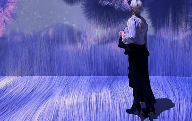
The Tinder profile pic of Very Peri. Source: Pantone
The colour of money
When people view a website, an app, or a product, between 62 and 90 per cent of their subconscious assessment is based on colours alone.
I admit I was shocked to see that statistic, but the choice of colour can make or break a business.
It should ram home the point of the importance of choosing the right colour for your content, website, or business.
And yes, even your dating profile.


Comments & Discussion
3 COMMENTS
Please login to read members' comments and participate in the discussion.